A set of high-level Flutter UI components and stand-alone widgets for easier implementation of most used UI features.
Components:
- StatefulData - A listenable data model and accompanying widgets to display the data according to its state.
- ResponsiveLayout - Allows easily build layouts that fits the current form factor.
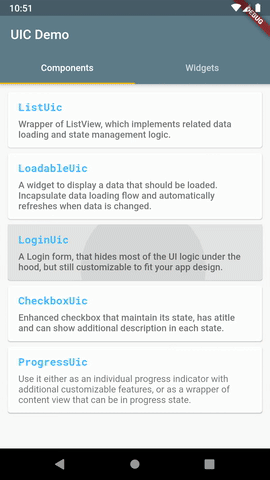
- CheckboxUic - Enhanced Checkbox that maintain its state, has a title and can show additional description in each state.
- ListUic - Wrapper of ListView, which implements related data loading and state management logic.
- LoginUic - A Login form, that hides most of the UI logic under the hood, but still customizable to fit your app design.
ProgressUic- Wrapper of ProgressIndicator with additional text.
Widgets:
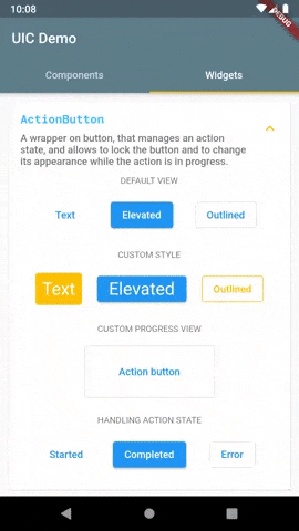
- ActionButton - Wrapper of Material button, that manages a state of an action which is performed on the button click, and shows progress while the action is performed.
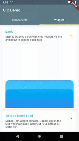
- Deck - Shows stacked cards, that can be expanded and collapsed.
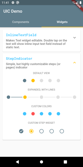
- InlineTextField - Text view with ability to inline edit its content.
- StepIndicator - Simple, but customizable step/page indicator.
A common case of displaying a piece of data in your UI is that you also would like to display some accompanying views while the data is loading, or if an error occurred.
StatefulData model
StatefulData is a wrapper of your data that handles data loading and notifies its listeners on data state changes.
In a simple case of one-time loaded data you define it like this:
final yourStatefulData = StatefulData<YourDataType>(
  loader: () => loadData(),
);
Once you've created the StatefulData object it starts loading data asynchronously using provided loader function and notifies listeners on data loading state.
There is an option to not start data loading immediately, use startLoading parameter to control this behavior:
final yourStatefulData = StatefulData<YourDataType>(
  loader: () => loadData(),
  startLoading = false,
);
In this case you can load data by calling loadData() method:
yourStatefulData.loadData();
This method also can be used to refresh the data at any time.
If you have a stream of data use the StatefulData.watch constructor as following:
final yourStatefulData = StatefulData<YourDataType>.watch(
  source: () => yourDataStream,
);
In this case your data will be automatically updated.
The following data states are supported by the StatefulData:
| State | Description |
|---|---|
initialLoading |
Data is loading at the first time (current data is empty). |
initialLoadingError |
An error occurred on initial data loading. |
empty |
Data loading is successfully finished, but the empty data was received. |
ready |
Data was successfully loaded and its value is available. |
loading |
Data loading is in progress. |
error |
An error occurred during data loading. |
StatefulDataView widget
Typically StatefulData is used with StatefulDataView. This is a widget that listens to provided StatefulData object and updates the UI according to the current data state.
  @override
  Widget build(BuildContext context) {
    return StatefulDataView<YourDataType>(
      statefulData: yourStatefulData,
      builder: (context, data) {
        return YourDataView(data: data);
      }
    );
  }
In the builder parameter you specify a function that returns your data view. It is called when state is changed to ready.
The following optional parameters are supported:
| Parameter | Description |
|---|---|
initialLoadingView |
A widget to display during initial data loading. |
initialLoadingErrorView |
A widget to display in case of initial data loading failed. |
emptyView |
A widget to display in case of empty data. |
loadingView |
A widget to display during data loading. |
errorBuilder |
A function that build a widget in case of error. |
StatefulDataView rebuilds on data state changes and displays either the data view or one of these views according to the current state.
If some of these parameters are missed, the built-in default views will be displayed.
See the demo app for example of using StatefulData model and StatefulDataView widget.
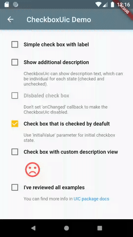
Enhanced, but still simple, checkbox widget. Unlike original Checkbox widget, CheckboxUic maintain its state. Also it has a title and can show an additional description.
- Supports all original parameters of Checkbox Flutter widget
- Has initial value
- Shows a title, which can be individual for checked and unchecked state
- Optionally shows additional text description, which can be individual for checked and unchecked state
- Supports custom widgets instead of text description
Usage
Import the package
import 'package:uic/checkbox_uic.dart';
Simple usage of CheckboxUic:
  @override
  Widget build(BuildContext context) {
    return Scaffold(
      appBar: AppBar(
        title: Text(widget.title),
      ),
      body: CheckboxUic(
          initialState: true,
          title: 'Show additional description',
          description: 'This is description for checked state.',
          descriptionUnchecked: 'CheckboxUic can show description text, which can be '
              'individual for each state (checked and unchecked).',
          onChanged: (value) {
            print('$value');
          },
      ),
    );
  }
See more examples in demo app.
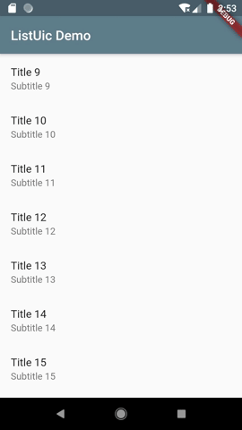
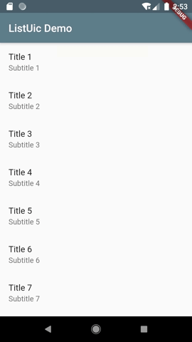
Almost each app has screens that display a list of items. Simple task at first look, it often requires much related staff to be implemented. All that boilerplate can be simplified with ListUic widget.
Features:
- Pull to Refresh gesture to reload list data
- Pagination (infinite scroll) to load next part of data on scroll to the end of the list
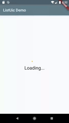
- Progress indicator for initial data loading
- Individual view for empty data
- Individual error view
- Progress indicator at the end of list when next page of items is loading
- Showing snack bar on failing loading data
Usage
Import the package
import 'package:uic/list_uic.dart';
Add ListUicController to your page's state:
class _MyHomePageState extends State<MyHomePage> {

  ListUicController<int> _controller;
  ...

  @override
  void initState() {
    super.initState();
    _controller = ListUicController<int>(
      onGetItems: (int page) => _getItems(page),
    );
    ...
  }
  ...
}
Add ListUic widget to your widget tree:
  @override
  Widget build(BuildContext context) {
    return Scaffold(
      appBar: AppBar(
        title: Text(widget.title),
      ),
      body: ListUic<int>(
        controller: _controller,
        itemBuilder: (item) {
          return ListTile(
            title: Text('Title ${item}'),
            subtitle: Text('Subtitle ${item}'),
          );
        },
      ),
    );
  }
Implement a function that will return a list of items:
  Future<List<int>> _getItems(int page) async {
    ...
  }
Read the docs for available customization options.
Also you can check demo app for details of using ListUic widget.
A Login form, that encapsulates most of UI logic for 'Sign in' feature, but still highly customizable to fit your app design.
Features:
- Displays a standard sign in form with username and password fields, and 'Sign In' button
- Implements basic username and password validation logic
- Provides a callback to perform the signing in action
- Handles signing in errors
- Allows to customize the form UI according to your app design
Usage
Import the package
import 'package:uic/login_uic.dart';
Add LoginUic widget to your widget tree:
  @override
  Widget build(BuildContext context) {
    return Scaffold(
      appBar: AppBar(
        title: Text(widget.title),
      ),
      body: Center(
        child: LoginUic(
          onSignIn: (username, password) => _signIn(username, password),
          onSignInCompleted: (context) => Navigator.push(
            context,
            MaterialPageRoute(
                builder: (context) =>
                    LoginUicSignedInScreen(title: 'LoginUic Demo')),
          ),
        ),
      ),
    );
  }
Implement a function that performs sign in action according to your business logic:
  Future<void> _signIn(String username, String password) async {
    ...
  }
LoginUic required parameters:
| Name | Description |
|---|---|
onSignIn |
A callback that perform sign in action. It is called when users clicks 'Sign In' button. |
onSignInCompleted |
Called when a user successfully signed in. Can be used to navigate to another screen. |
See full example of LoginUic usage in the demo app and package docs.
A wrapper of Material buttons, that incapsulates managing of the local state of an action which is performed on the button click, and updates the button content to display the progress view when the action is performed.
- Uses TextButton, ElevatedButton or OutlineButton as an underlying button widget.
- Supports all attributes of standard buttons.
- Allows to display a simple progress indicator or a custom view when the action is performed.
- Provides callbacks on action state changes.
Usage
Import the package
import 'package:uic/widgets.dart';
You can use ActionButton the same way you are using normal button widgets. But instead of 'onPressed', you provide action function in the action attribute.
  @override
  Widget build(BuildContext context) {
    return Scaffold(
      appBar: AppBar(
        title: Text(widget.title),
      ),
      body: Center(
        child: ActionButton(
          action: () async {
            return Future.delayed(Duration(seconds: 5));
          },
          child: Text('Button title'),
        ),
      ),
    );
  }
Additional parameters of ActionButton widget:
| Name | Description |
|---|---|
buttonType |
Defines the underlying Material button widget - TextButton, ElevatedButton or OutlineButton. |
onActionCompleted |
Called when the action successfully completed. |
onActionError |
Called when the action finished with error. |
onActionStarted |
Called immediately after the button pressed. |
progressView |
Custom view that is shown as a button child during the action. |
See full example of ActionButton usage in the demo app and package docs.
Displays stacked child widgets (typically cards), so the only headers are visible
initially. Each Deck item can be expanded and collapsed.
This is an alternative to a BottomSheet widget, if you need to display multiple bottom sheets, which are coordinated.
- Supports separate views for collapsed and expanded state for each item.
- Animates expanding and collapsing.
Usage
Import the package
import 'package:uic/widgets.dart';
Typically you will use Deck in a Stack, where the first layer is your main content and a Deck will overlap the conten.
The usage might look like this:
  @override
  Widget build(BuildContext context) {
    return Scaffold(
      appBar: AppBar(
        title: Text(widget.title),
      ),
      body: Stack(
        children: [
          YourMainWidget(),
          Align(
            alignment: Alignment.bottomCenter,
            child: Deck(
                items: [
                  DeckItem(
                    child: YourFirstItemCollapsedView(),
                    childExpanded: YourFirstItemExpandedView(),
                  ),
                  DeckItem(
                    child: YourSecondItemCollapsedView(),
                    childExpanded: YourSecondItemExpandedView(),
                  ),
                ],
            ),
          ),
        ]),
    );
  }
You must provide the list of DeckItem objects, which defines both the collapsed and expanded appearance of your Deck items.
Additional parameters of Deck widget:
| Name | Description |
|---|---|
collapsedSize |
The size of child widget in the collapsed state. |
expandedSize |
The size of child widget in the expanded state. |
mainAxisSize |
The maximum Deck size. |
See full example of Deck usage in demo app and package docs.
Makes Text view editable. In the view mode is shows a normal Text widget (or your custom view). On double tap it is switching to editing mode, and allow user to inline edit the text.
- Supports text styling in both view and editing mode.
- Supports text field decoration in the editing mode.
- Uses minimalistic appearance of text field in editing mode by default.
- Notifies when user done editing text.
- Supports custom widget to show in view mode instead of normal Text widget.

Usage
Import the package
import 'package:uic/widgets.dart';
Simple usage of InlineTextWidget:
  @override
  Widget build(BuildContext context) {
    return Scaffold(
      appBar: AppBar(
        title: Text(widget.title),
      ),
      body: Row(
          children: <Widget>[
            Text('You can '),
            InlineTextField(
              text: 'edit me',
              style: Theme.of(context).textTheme.bodyText1.copyWith(
                color: Colors.lightBlueAccent,
              ),
              onEditingComplete: (value) {
                _scaffoldKey.currentState.showSnackBar(SnackBar(
                  backgroundColor: Theme.of(context).accentColor,
                  content: Text(value),
                ));
              },
            ),
            Text(' right here'),
          ],
        ),
    );
  }
See more available options of InlineTextField examples in demo app and package docs.
Simple, but customizable step (page) indicator. It can be useful to show a current item in sliders and carousels, or a current page in a flow where user has to pass through a sequence of screens.
- Supports custom colors for completed, selected and incomplete steps.
- Optionally shows lines connecting step items.
- Supports custom line colors, width and length.
- Can be expanded, to fit parent size.
- Horizontal or vertical orientation (NOT IMPLEMENTED YET)
- Notifies when user select a step. (NOT IMPLEMENTED YET)
- Supports custom widgets for complete, selected and incomplete steps.
- Builder function that allow to define individual view for each step. (NOT IMPLEMENTED YET)
Usage
Import the package
import 'package:uic/widgets.dart';
Simple usage of StepIndicator:
  @override
  Widget build(BuildContext context) {
    return Scaffold(
      appBar: AppBar(
        title: Text(widget.title),
      ),
      body: Padding(
        padding: const EdgeInsets.all(16.0),
          child: StepIndicator(
            selectedStepIndex: 2,
            totalSteps: 5,
          ),
        ),
    );
  }
You must provide the current step index and total number of steps.
See more available options of StepIndicator in demo app and package docs.