- 19 April, 2024
- FlutterHQ.com
227 Flutter code samples, examples and snippets for the material-library
Get a better understanding on how to user the material-library with our list of code-samples, examples and snippets.
Material:ReorderableList
While a drag is underway, the widget returned by the [proxyDecorator]
serves as a "proxy" (a substitute) for the item in the list. The proxy is
created with the original list item as its child. The [proxyDecorator]
in this example is similar to the default one except that it changes the
proxy item's background color.
Material:DatePicker
This sample demonstrates how to create a restorable Material date picker.
This is accomplished by enabling state restoration by specifying
[MaterialApp.restorationScopeId] and using [Navigator.restorablePush] to
push [DatePickerDialog] when the button is tapped.
Material:Tooltip
This example shows how [Tooltip] can be shown manually with [TooltipTriggerMode.manual]
by calling the [TooltipState.ensureTooltipVisible] function.
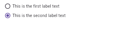
Material:Radio
Here is an example of Radio widgets wrapped in ListTiles, which is similar
to what you could get with the RadioListTile widget.
The currently selected character is passed into `groupValue`, which is
maintained by the example's `State`. In this case, the first `Radio`
will start off selected because `_character` is initialized to
`SingingCharacter.lafayette`.
If the second radio button is pressed, the example's state is updated
with `setState`, updating `_character` to `SingingCharacter.jefferson`.
This causes the buttons to rebuild with the updated `groupValue`, and
therefore the selection of the second button.
Requires one of its ancestors to be a [Material] widget.
Material:InputDecorator
This example shows how the prefix icon alignment can be changed using [Align] with
a fixed `widthFactor` and `heightFactor`.
Material:TextFormField
This example shows how to move the focus to the next field when the user
presses the SPACE key.
Material:About
This sample shows two ways to open [AboutDialog]. The first one
uses an [AboutListTile], and the second uses the [showAboutDialog] function.
Material:RefreshIndicator
This example shows how [RefreshIndicator] can be triggered in different ways.
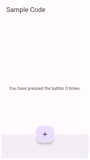
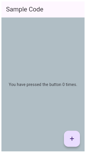
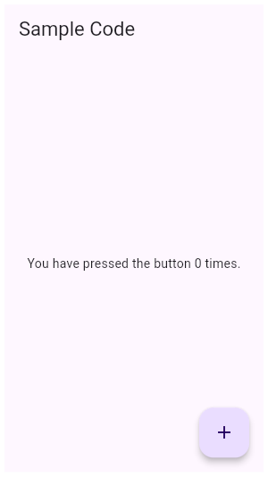
Material:Scaffold
This example shows a [Scaffold] with an [AppBar], a [BottomAppBar] and a
[FloatingActionButton]. The [body] is a [Text] placed in a [Center] in order
to center the text within the [Scaffold]. The [FloatingActionButton] is
centered and docked within the [BottomAppBar] using
[FloatingActionButtonLocation.centerDocked]. The [FloatingActionButton] is
connected to a callback that increments a counter.
Material:IconButton
In this sample the icon button's background color is defined with an [Ink]
widget whose child is an [IconButton]. The icon button's filled background
is a light shade of blue, it's a filled circle, and it's as big as the
button is.

Material:InputDecorator
This sample shows how to style a `TextField` with a prefixIcon that changes color
based on the `MaterialState`. The color defaults to gray, be blue while focused
and red if in an error state.
Material:AppBar
This sample shows a [SliverAppBar] and it's behavior when using the
[pinned], [snap] and [floating] parameters.
Material:Card
This sample shows creation of a [Card] widget that shows album information
and two actions.
Material:Dialog
This sample demonstrates how to use [showDialog] to display a dialog box.
Material:Scaffold
When the [Scaffold] is actually created in the same `build` function, the
`context` argument to the `build` function can't be used to find the
[Scaffold] (since it's "above" the widget being returned in the widget
tree). In such cases, the following technique with a [Builder] can be used
to provide a new scope with a [BuildContext] that is "under" the
[Scaffold]:
Material:MaterialState
This example defines a subclass of [RoundedRectangleBorder] and an
implementation of [MaterialStateOutlinedBorder], that resolves to
[RoundedRectangleBorder] when its widget is selected.
Material:ProgressIndicator
This example shows a [LinearProgressIndicator] with a changing value.
Material:Dialog
This sample demonstrates how to create a restorable Material dialog. This is
accomplished by enabling state restoration by specifying
[MaterialApp.restorationScopeId] and using [Navigator.restorablePush] to
push [DialogRoute] when the button is tapped.
{@macro flutter.widgets.RestorationManager}
Material:Card
This sample shows creation of [Card] widgets for elevated, filled and
outlined types, as described in: https://m3.material.io/components/cards/overview
Material:Dialog
This demo shows a [TextButton] which when pressed, calls [showDialog]. When called, this method
displays a Material dialog above the current contents of the app and returns
a [Future] that completes when the dialog is dismissed.
Material:NavigationRail
This example shows a [NavigationRail] used within a Scaffold with 3
[NavigationRailDestination]s. The main content is separated by a divider
(although elevation on the navigation rail can be used instead). The
`_selectedIndex` is updated by the `onDestinationSelected` callback.
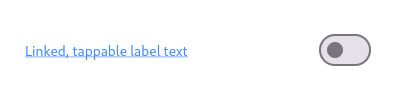
Material:CheckboxListTile
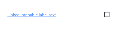
Here is an example of a custom labeled checkbox widget, called
LinkedLabelCheckbox, that includes an interactive [RichText] widget that
handles tap gestures.
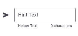
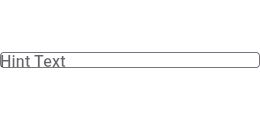
Material:InputDecorator
This sample shows how to style a `TextField` using an `InputDecorator`. The
TextField displays a "send message" icon to the left of the input area,
which is surrounded by a border an all sides. It displays the `hintText`
inside the input area to help the user understand what input is required. It
displays the `helperText` and `counterText` below the input area.
Material:Autocomplete
This example shows how to create an Autocomplete widget with a custom type.
Try searching with text from the name or email field.
Material:CheckboxListTile
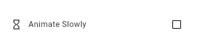
This widget shows a checkbox that, when checked, slows down all animations
(including the animation of the checkbox itself getting checked!).
This sample requires that you also import 'package:flutter/scheduler.dart',
so that you can reference [timeDilation].
Material:ButtonStyle
This sample shows how to create each of the Material 3 button types with Flutter.
Material:ListTile
Here is an example of using a [StatefulWidget] to keep track of the
selected index, and using that to set the `selected` property on the
corresponding [ListTile].
Material:NavigationBar
This example shows a [NavigationBar] as it is used within a [Scaffold]
widget. The [NavigationBar] has three [NavigationDestination] widgets
and the [selectedIndex] is set to index 0. The `onDestinationSelected` callback
changes the selected item's index and displays a corresponding widget in the body of the [Scaffold].
Material:Scaffold
Typical usage of the [ScaffoldMessenger.of] function is to call it in
response to a user gesture or an application state change.
Material:FlexibleSpaceBar
This sample application demonstrates the different features of the
[FlexibleSpaceBar] when used in a [SliverAppBar]. This app bar is configured
to stretch into the overscroll space, and uses the
[FlexibleSpaceBar.stretchModes] to apply `fadeTitle`, `blurBackground` and
`zoomBackground`. The app bar also makes use of [CollapseMode.parallax] by
default.
Material:ThemeData
This sample shows how to create and use a subclass of [ThemeExtension] that
defines two colors.
Material:Scaffold
Here is an example of showing a [SnackBar] when the user presses a button.
Material:Radio
This example shows how to enable deselecting a radio button by setting the
[toggleable] attribute.
Material:SwitchListTile
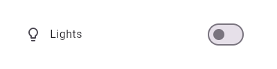
This widget shows a switch that, when toggled, changes the state of a [bool]
member field called `_lights`.
Material:Scaffold
Typical usage of the [Scaffold.of] function is to call it from within the
`build` method of a child of a [Scaffold].
Material:TextButton
This sample shows how to render a disabled TextButton, an enabled TextButton
and lastly a TextButton with gradient background.
Material:DatePicker
This sample demonstrates how to create a restorable Material date range picker.
This is accomplished by enabling state restoration by specifying
[MaterialApp.restorationScopeId] and using [Navigator.restorablePush] to
push [DateRangePickerDialog] when the button is tapped.
Material:ExpansionTile
This example demonstrates different configurations of ExpansionTile.
Material:Stepper
An example the shows how to use the [Stepper], and the [Stepper] UI
appearance.
Material:SwitchListTile
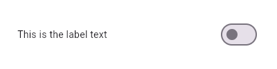
Here is an example of a custom LabeledSwitch widget, but you can easily
make your own configurable widget.
Material:NavigationRail
This sample shows the creation of [NavigationRail] widget used within a Scaffold with 3
[NavigationRailDestination]s, as described in: https://m3.material.io/components/navigation-rail/overview
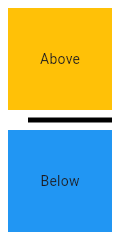
Material:Divider
This sample shows how to display a Divider between an orange and blue box
inside a column. The Divider is 20 logical pixels in height and contains a
vertically centered black line that is 5 logical pixels thick. The black
line is indented by 20 logical pixels.
Material:Scrollbar
When [thumbVisibility] is true, the scrollbar thumb will remain visible
without the fade animation. This requires that a [ScrollController] is
provided to controller, or that the [PrimaryScrollController] is available.
When a [ScrollView.scrollDirection] is [Axis.horizontal], it is recommended
that the [Scrollbar] is always visible, since scrolling in the horizontal
axis is less discoverable.
Material:ToggleButtons
This example showcase [ToggleButtons] in various configurations.
Material:SwitchListTile
Here is an example of a custom labeled radio widget, called
LinkedLabelRadio, that includes an interactive [RichText] widget that
handles tap gestures.
Material:RadioListTile
This example shows how to enable deselecting a radio button by setting the
[toggleable] attribute.
Material:Tooltip
This example show a basic [Tooltip] which has a [Text] as child.
[message] contains your label to be shown by the tooltip when
the child that Tooltip wraps is hovered over on web or desktop. On mobile,
the tooltip is shown when the widget is long pressed.
Material:Checkbox
This example shows how you can override the default theme of
of a [Checkbox] with a [MaterialStateProperty].
In this example, the checkbox's color will be `Colors.blue` when the [Checkbox]
is being pressed, hovered, or focused. Otherwise, the checkbox's color will
be `Colors.red`.
Material:Tooltip
This example shows a rich [Tooltip] that specifies the [richMessage]
parameter instead of the [message] parameter (only one of these may be
non-null. Any [InlineSpan] can be specified for the [richMessage] attribute,
including [WidgetSpan].
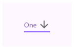
Material:Dropdown
This sample shows a `DropdownButton` with a large arrow icon,
purple text style, and bold purple underline, whose value is one of "One",
"Two", "Free", or "Four".
Material:MaterialState
This example defines a subclass of [MaterialStateBorderSide], that resolves
to a red border side when its widget is selected.
Material:Scaffold
Sometimes [SnackBar]s are produced by code that doesn't have ready access
to a valid [BuildContext]. One such example of this is when you show a
SnackBar from a method outside of the `build` function. In these
cases, you can assign a [GlobalKey] to the [ScaffoldMessenger]. This
example shows a key being used to obtain the [ScaffoldMessengerState]
provided by the [MaterialApp].
Material:Scaffold
This example shows a [Scaffold] with a blueGrey [backgroundColor], [body]
and [FloatingActionButton]. The [body] is a [Text] placed in a [Center] in
order to center the text within the [Scaffold]. The [FloatingActionButton]
is connected to a callback that increments a counter.
Material:CheckboxListTile
Here is an example of a custom LabeledCheckbox widget, but you can easily
make your own configurable widget.
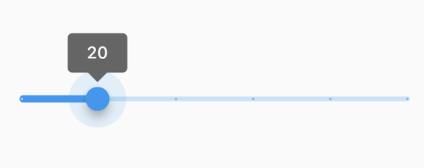
Material:RangeSlider
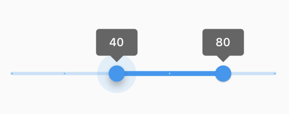
This range values are in intervals of 20 because the Range Slider has 5
divisions, from 0 to 100. This means are values are split between 0, 20, 40,
60, 80, and 100. The range values are initialized with 40 and 80 in this demo.
Material:Scaffold
To disable the drawer edge swipe, set the
[Scaffold.endDrawerEnableOpenDragGesture] to false. Then, use
[ScaffoldState.openEndDrawer] to open the drawer and [Navigator.pop] to
close it.
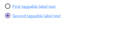
Material:RadioListTile
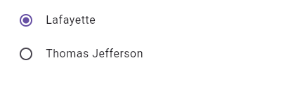
This widget shows a pair of radio buttons that control the `_character`
field. The field is of the type `SingingCharacter`, an enum.
Material:Card
This sample shows creation of a [Card] widget that can be tapped. When
tapped this [Card]'s [InkWell] displays an "ink splash" that fills the
entire card.
Material:TabController
This example shows how to listen to page updates in [TabBar] and [TabBarView]
when using [DefaultTabController].
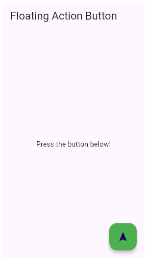
Material:FloatingActionButton
This sample shows the creation of [FloatingActionButton] widget in the typical location in a Scaffold,
as described in: https://m3.material.io/components/floating-action-button/overview
Material:AppBar
This sample shows an [AppBar] with two simple actions. The first action
opens a [SnackBar], while the second action navigates to a new page.
Material:Scaffold
To disable the drawer edge swipe, set the
[Scaffold.drawerEnableOpenDragGesture] to false. Then, use
[ScaffoldState.openDrawer] to open the drawer and [Navigator.pop] to close
it.
Material:Dialog
This sample shows the creation of [AlertDialog], as described in:
https://m3.material.io/components/dialogs/overview
Material:Scaffold
Here is an example of showing a [MaterialBanner] when the user presses a button.
Material:ThemeData
This sample shows how to create and use a subclass of [ThemeExtension] that
defines two colors.
Material:FloatingActionButton
This sample shows the creation of all the variants of [FloatingActionButton] widget as
described in: https://m3.material.io/components/floating-action-button/overview
Material:ElevatedButton
This sample produces an enabled and a disabled ElevatedButton.
Material:InputDecorator
This sample shows how to style a `TextField` with a prefixIcon that changes color
based on the `MaterialState` through the use of `ThemeData`. The color defaults
to gray, be blue while focused and red if in an error state.
Material:FloatingActionButton
This example shows how to display a [FloatingActionButton] in a
[Scaffold], with a pink [backgroundColor] and a thumbs up [Icon].
Material:InputDecorator
It's possible to override the label style for just the error state, or
just the default state, or both.
In this example the [labelStyle] is specified with a [MaterialStateProperty]
which resolves to a text style whose color depends on the decorator's
error state.
Material:BottomNavigationBar
This example shows a [BottomNavigationBar] as it is used within a [Scaffold]
widget. The [BottomNavigationBar] has three [BottomNavigationBarItem]
widgets, which means it defaults to [BottomNavigationBarType.fixed], and
the [currentIndex] is set to index 0. The selected item is
amber. The `_onItemTapped` function changes the selected item's index
and displays a corresponding message in the center of the [Scaffold].
Material:InputDecorator
This example shows the differences between two `TextField` widgets when
[prefixIconConstraints] is set to the default value and when one is not.
Note that [isDense] must be set to true to be able to
set the constraints smaller than 48px.
If null, [BoxConstraints] with a minimum width and height of 48px is
used.
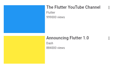
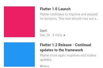
Material:ListTile
Here is an example of a custom list item that resembles a YouTube-related
video list item created with [Expanded] and [Container] widgets.
Material:Slider
The Sliders value is part of the Stateful widget subclass to change the value
setState was called.
Material:InputDecorator
This example shows how the suffix icon alignment can be changed using [Align] with
a fixed `widthFactor` and `heightFactor`.
Material:RadioListTile
Here is an example of a custom labeled radio widget, called
LinkedLabelRadio, that includes an interactive [RichText] widget that
handles tap gestures.
Material:Scaffold
Here is an example of showing a [SnackBar] when the user presses a button.
Material:InputDecorator
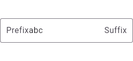
This sample shows how to style a `TextField` with a round border and
additional text before and after the input area. It displays "Prefix" before
the input area, and "Suffix" after the input area.
Material:Autocomplete
This example shows how to create a very basic Autocomplete widget using the
default UI.
Material:Tabs
[TabBar] can also be implemented by using a [TabController] which provides more options
to control the behavior of the [TabBar] and [TabBarView]. This can be used instead of
a [DefaultTabController], demonstrated below.
Material:Dropdown
This sample shows a `DropdownButton` with a button with [Text] that
corresponds to but is unique from [DropdownMenuItem].
Material:InkWell
Tap the container to cause it to grow. Then, tap it again and hold before
the widget reaches its maximum size to observe the clipped ink splash.
Material:BottomNavigationBar
This example shows a [BottomNavigationBar] as it is used within a [Scaffold]
widget. The [BottomNavigationBar] has four [BottomNavigationBarItem]
widgets, which means it defaults to [BottomNavigationBarType.shifting], and
the [currentIndex] is set to index 0. The selected item is amber in color.
With each [BottomNavigationBarItem] widget, backgroundColor property is
also defined, which changes the background color of [BottomNavigationBar],
when that item is selected. The `_onItemTapped` function changes the
selected item's index and displays a corresponding message in the center of
the [Scaffold].
Material:Divider
This sample shows how to display a [VerticalDivider] between a purple and orange box
inside a [Row]. The [VerticalDivider] is 20 logical pixels in width and contains a
horizontally centered black line that is 1 logical pixels thick. The grey
line is indented by 20 logical pixels.
Material:ExpansionPanel
Here is a simple example of how to implement ExpansionPanelList.radio.
Material:FloatingActionButtonLocation
This is an example of a user-defined [FloatingActionButtonLocation].
The example shows a [Scaffold] with an [AppBar], a [BottomAppBar], and a
[FloatingActionButton] using a custom [FloatingActionButtonLocation].
The new [FloatingActionButtonLocation] is defined
by extending [StandardFabLocation] with two mixins,
[FabEndOffsetX] and [FabFloatOffsetY], and overriding the
[getOffsetX] method to adjust the FAB's x-coordinate, creating a
[FloatingActionButtonLocation] slightly different from
[FloatingActionButtonLocation.endFloat].
Material:InputDecorator
This sample shows how to style a "collapsed" `TextField` using an
`InputDecorator`. The collapsed `TextField` surrounds the hint text and
input area with a border, but does not add padding around them.
Material:InkDecoration
Wrapping the [Ink] in a clipping widget directly will not work since the
[Material] it will be printed on is responsible for clipping.
In this example the image is not being clipped as expected. This is because
it is being rendered onto the Scaffold body Material, which isn't wrapped in
the [ClipRRect].
Material:SnackBar
Here is an example of a customized [SnackBar]. It utilizes
[behavior], [shape], [padding], [width], and [duration] to customize the
location, appearance, and the duration for which the [SnackBar] is visible.
Material:RadioListTile
Here is an example of a custom LabeledRadio widget, but you can easily
make your own configurable widget.
Material:InputDecorator
This example shows the differences between two `TextField` widgets when
[suffixIconConstraints] is set to the default value and when one is not.
Note that [isDense] must be set to true to be able to
set the constraints smaller than 48px.
If null, [BoxConstraints] with a minimum width and height of 48px is
used.
Material:TextField
This sample shows how to get a value from a TextField via the [onSubmitted]
callback.
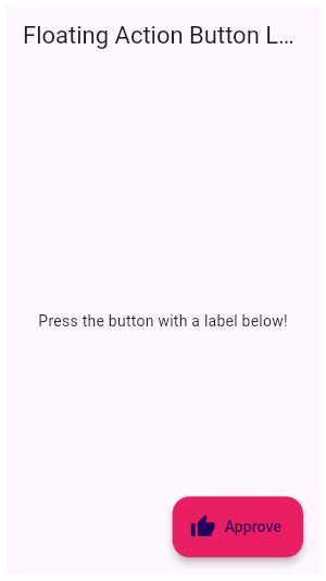
Material:FloatingActionButton
This example shows how to make an extended [FloatingActionButton] in a
[Scaffold], with a pink [backgroundColor], a thumbs up [Icon] and a
[Text] label that reads "Approve".
Material:ExpansionPanel
Here is a simple example of how to implement ExpansionPanelList.
Material:MaterialState
This example shows how you can override the default text and icon
color (the "foreground color") of a [TextButton] with a
[MaterialStateProperty]. In this example, the button's text color
will be `Colors.blue` when the button is being pressed, hovered,
or focused. Otherwise, the text color will be `Colors.red`.
Material:InkDecoration
One solution would be to deliberately wrap the [Ink.image] in a [Material].
This makes sure the Material that the image is painted on is also responsible
for clipping said content.
Material:ListTile
Here is an example of an article list item with multiline titles and
subtitles. It utilizes [Row]s and [Column]s, as well as [Expanded] and
[AspectRatio] widgets to organize its layout.
Material:BottomAppBar
This example shows the [BottomAppBar], which can be configured to have a notch using the
[BottomAppBar.shape] property. This also includes an optional [FloatingActionButton], which illustrates
the [FloatingActionButtonLocation]s in relation to the [BottomAppBar].
Material:Scrollbar
This sample shows a [Scrollbar] that executes a fade animation as scrolling
occurs. The Scrollbar will fade into view as the user scrolls, and fade out
when scrolling stops.
Material:ProgressIndicator
This example shows a [CircularProgressIndicator] with a changing value.
Material:Tabs
This sample shows the implementation of [TabBar] and [TabBarView] using a [DefaultTabController].
Each [Tab] corresponds to a child of the [TabBarView] in the order they are written.
Material:Chip
This sample shows how to use [onDeleted] to remove an entry when the
delete button is tapped.
Material:Banner
MaterialBanner's can also be presented through a [ScaffoldMessenger].
Here is an example where ScaffoldMessengerState.showMaterialBanner() is used to show the MaterialBanner.
Material:SnackBar
Here is an example of a [SnackBar] with an [action] button implemented using
[SnackBarAction].
Material:Scaffold
This example shows a [Scaffold] with a [body] and [FloatingActionButton].
The [body] is a [Text] placed in a [Center] in order to center the text
within the [Scaffold]. The [FloatingActionButton] is connected to a
callback that increments a counter.
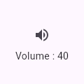
Material:IconButton
This sample shows an `IconButton` that uses the Material icon "volume_up" to
increase the volume.
Material:BottomSheet
This example demonstrates how to use `showModalBottomSheet` to display a
bottom sheet that obscures the content behind it when a user taps a button.
It also demonstrates how to close the bottom sheet using the [Navigator]
when a user taps on a button inside the bottom sheet.
Material:NavigationRail
This example shows how to use this animation to create a [FloatingActionButton]
that animates itself between the normal and extended states of the
[NavigationRail].
An instance of `MyNavigationRailFab` is created for [NavigationRail.leading].
Pressing the FAB button toggles the "extended" state of the [NavigationRail].
Material:Dropdown
This sample shows a `DropdownButton` with a dropdown button text style
that is different than its menu items.
Material:PopupMenu
This example shows a menu with four items, selecting between an enum's
values and setting a `_selectedMenu` field based on the selection
Material:Dialog
This sample shows the creation of [showDialog], as described in:
https://m3.material.io/components/dialogs/overview
Material:Tooltip
This example covers most of the attributes available in Tooltip.
`decoration` has been used to give a gradient and borderRadius to Tooltip.
`height` has been used to set a specific height of the Tooltip.
`preferBelow` is false, the tooltip will prefer showing above [Tooltip]'s child widget.
However, it may show the tooltip below if there's not enough space
above the widget.
`textStyle` has been used to set the font size of the 'message'.
`showDuration` accepts a Duration to continue showing the message after the long
press has been released or the mouse pointer exits the child widget.
`waitDuration` accepts a Duration for which a mouse pointer has to hover over the child
widget before the tooltip is shown.
Material:Scaffold
This example demonstrates how to use `showBottomSheet` to display a
bottom sheet when a user taps a button. It also demonstrates how to
close a bottom sheet using the Navigator.
Material:MaterialState
This example defines a mouse cursor that resolves to
[SystemMouseCursors.forbidden] when its widget is disabled.
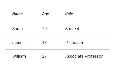
Material:DataTable
This sample shows how to display a [DataTable] with three columns: name, age, and
role. The columns are defined by three [DataColumn] objects. The table
contains three rows of data for three example users, the data for which
is defined by three [DataRow] objects.
Material:InputDecorator
This example shows a `TextField` with a [Text.rich] widget as the [label].
The widget contains multiple [Text] widgets with different [TextStyle]'s.
Material:DataTable
This sample shows how to display a [DataTable] with alternate colors per
row, and a custom color for when the row is selected.
Material:InputDecorator
It's possible to override the label style for just the error state, or
just the default state, or both.
In this example the [floatingLabelStyle] is specified with a
[MaterialStateProperty] which resolves to a text style whose color depends
on the decorator's error state.
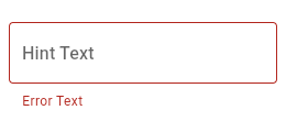
Material:InputDecorator
This sample shows how to create a `TextField` with hint text, a red border
on all sides, and an error message. To display a red border and error
message, provide `errorText` to the `InputDecoration` constructor.