FloatingActionButton
sample.packages.flutter.lib.src.material.floating_action_button.63.
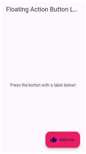
This example shows how to make an extended [FloatingActionButton] in a [Scaffold], with a pink [backgroundColor], a thumbs up [Icon] and a [Text] label that reads "Approve".
import 'package:flutter/material.dart';

void main() => runApp(const MyApp());

class MyApp extends StatelessWidget {
  const MyApp({Key? key}) : super(key: key);

  @override
  Widget build(BuildContext context) {
    return const MaterialApp(
      home: FabExample(),
    );
  }
}

class FabExample extends StatelessWidget {
  const FabExample({Key? key}) : super(key: key);

  @override
  Widget build(BuildContext context) {
    return Scaffold(
      appBar: AppBar(
        title: const Text('FloatingActionButton Sample'),
      ),
      body: const Center(
        child: Text('Press the button with a label below!'),
      ),
      floatingActionButton: FloatingActionButton.extended(
        onPressed: () {
          // Add your onPressed code here!
        },
        label: const Text('Approve'),
        icon: const Icon(Icons.thumb_up),
        backgroundColor: Colors.pink,
      ),
    );
  }
}
SHARE: