InputDecorator
sample.packages.flutter.lib.src.material.input_decorator.2359.
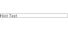
This sample shows how to style a "collapsed" TextField using an
InputDecorator. The collapsed TextField surrounds the hint text and
input area with a border, but does not add padding around them.
import 'package:flutter/material.dart';

void main() => runApp(const MyApp());

class MyApp extends StatelessWidget {
  const MyApp({Key? key}) : super(key: key);

  static const String _title = 'Flutter Code Sample';

  @override
  Widget build(BuildContext context) {
    return MaterialApp(
      title: _title,
      home: Scaffold(
        appBar: AppBar(title: const Text(_title)),
        body: const MyStatelessWidget(),
      ),
    );
  }
}

class MyStatelessWidget extends StatelessWidget {
  const MyStatelessWidget({Key? key}) : super(key: key);

  @override
  Widget build(BuildContext context) {
    return const TextField(
      decoration: InputDecoration.collapsed(
        hintText: 'Hint Text',
        border: OutlineInputBorder(),
      ),
    );
  }
}
SHARE: