InputDecorator
sample.packages.flutter.lib.src.material.input_decorator.2379.
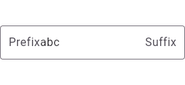
This sample shows how to style a TextField with a round border and
additional text before and after the input area. It displays "Prefix" before
the input area, and "Suffix" after the input area.
import 'package:flutter/material.dart';

void main() => runApp(const MyApp());

class MyApp extends StatelessWidget {
  const MyApp({Key? key}) : super(key: key);

  static const String _title = 'Flutter Code Sample';

  @override
  Widget build(BuildContext context) {
    return MaterialApp(
      title: _title,
      home: Scaffold(
        appBar: AppBar(title: const Text(_title)),
        body: const MyStatelessWidget(),
      ),
    );
  }
}

class MyStatelessWidget extends StatelessWidget {
  const MyStatelessWidget({Key? key}) : super(key: key);

  @override
  Widget build(BuildContext context) {
    return TextFormField(
      initialValue: 'abc',
      decoration: const InputDecoration(
        prefix: Text('Prefix'),
        suffix: Text('Suffix'),
        border: OutlineInputBorder(),
      ),
    );
  }
}
SHARE: