RangeSlider
sample.packages.flutter.lib.src.material.range_slider.37.
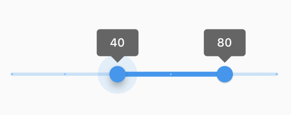
This range values are in intervals of 20 because the Range Slider has 5 divisions, from 0 to 100. This means are values are split between 0, 20, 40, 60, 80, and 100. The range values are initialized with 40 and 80 in this demo.
import 'package:flutter/material.dart';

void main() => runApp(const MyApp());

class MyApp extends StatelessWidget {
  const MyApp({Key? key}) : super(key: key);

  static const String _title = 'Flutter Code Sample';

  @override
  Widget build(BuildContext context) {
    return MaterialApp(
      title: _title,
      home: Scaffold(
        appBar: AppBar(title: const Text(_title)),
        body: const MyStatefulWidget(),
      ),
    );
  }
}

class MyStatefulWidget extends StatefulWidget {
  const MyStatefulWidget({Key? key}) : super(key: key);

  @override
  State createState() => _MyStatefulWidgetState();
}

class _MyStatefulWidgetState extends State {
  RangeValues _currentRangeValues = const RangeValues(40, 80);

  @override
  Widget build(BuildContext context) {
    return RangeSlider(
      values: _currentRangeValues,
      max: 100,
      divisions: 5,
      labels: RangeLabels(
        _currentRangeValues.start.round().toString(),
        _currentRangeValues.end.round().toString(),
      ),
      onChanged: (RangeValues values) {
        setState(() {
          _currentRangeValues = values;
        });
      },
    );
  }
}
SHARE: