SwitchListTile
sample.packages.flutter.lib.src.material.switch_list_tile.97.
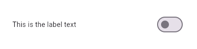
Here is an example of a custom LabeledSwitch widget, but you can easily make your own configurable widget.
import 'package:flutter/material.dart';

void main() => runApp(const MyApp());

class MyApp extends StatelessWidget {
  const MyApp({Key? key}) : super(key: key);

  static const String _title = 'Flutter Code Sample';

  @override
  Widget build(BuildContext context) {
    return MaterialApp(
      title: _title,
      home: Scaffold(
        appBar: AppBar(title: const Text(_title)),
        body: const Center(
          child: MyStatefulWidget(),
        ),
      ),
    );
  }
}

class LabeledSwitch extends StatelessWidget {
  const LabeledSwitch({
    Key? key,
    required this.label,
    required this.padding,
    required this.value,
    required this.onChanged,
  }) : super(key: key);

  final String label;
  final EdgeInsets padding;
  final bool value;
  final ValueChanged onChanged;

  @override
  Widget build(BuildContext context) {
    return InkWell(
      onTap: () {
        onChanged(!value);
      },
      child: Padding(
        padding: padding,
        child: Row(
          children: [
            Expanded(child: Text(label)),
            Switch(
              value: value,
              onChanged: (bool newValue) {
                onChanged(newValue);
              },
            ),
          ],
        ),
      ),
    );
  }
}

class MyStatefulWidget extends StatefulWidget {
  const MyStatefulWidget({Key? key}) : super(key: key);

  @override
  State createState() => _MyStatefulWidgetState();
}

class _MyStatefulWidgetState extends State {
  bool _isSelected = false;

  @override
  Widget build(BuildContext context) {
    return LabeledSwitch(
      label: 'This is the label text',
      padding: const EdgeInsets.symmetric(horizontal: 20.0),
      value: _isSelected,
      onChanged: (bool newValue) {
        setState(() {
          _isSelected = newValue;
        });
      },
    );
  }
}
SHARE: