CheckboxListTile
sample.packages.flutter.lib.src.material.checkbox_list_tile.74.
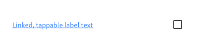
Here is an example of a custom labeled checkbox widget, called LinkedLabelCheckbox, that includes an interactive [RichText] widget that handles tap gestures.
import 'package:flutter/gestures.dart';

import 'package:flutter/material.dart';

void main() => runApp(const MyApp());

class MyApp extends StatelessWidget {
  const MyApp({Key? key}) : super(key: key);

  static const String _title = 'Flutter Code Sample';

  @override
  Widget build(BuildContext context) {
    return MaterialApp(
      title: _title,
      home: Scaffold(
        appBar: AppBar(title: const Text(_title)),
        body: const Center(
          child: MyStatefulWidget(),
        ),
      ),
    );
  }
}

class LinkedLabelCheckbox extends StatelessWidget {
  const LinkedLabelCheckbox({
    Key? key,
    required this.label,
    required this.padding,
    required this.value,
    required this.onChanged,
  }) : super(key: key);

  final String label;
  final EdgeInsets padding;
  final bool value;
  final ValueChanged onChanged;

  @override
  Widget build(BuildContext context) {
    return Padding(
      padding: padding,
      child: Row(
        children: [
          Expanded(
            child: RichText(
              text: TextSpan(
                text: label,
                style: const TextStyle(
                  color: Colors.blueAccent,
                  decoration: TextDecoration.underline,
                ),
                recognizer: TapGestureRecognizer()
                  ..onTap = () {
                    debugPrint('Label has been tapped.');
                  },
              ),
            ),
          ),
          Checkbox(
            value: value,
            onChanged: (bool? newValue) {
              onChanged(newValue!);
            },
          ),
        ],
      ),
    );
  }
}

class MyStatefulWidget extends StatefulWidget {
  const MyStatefulWidget({Key? key}) : super(key: key);

  @override
  State createState() => _MyStatefulWidgetState();
}

class _MyStatefulWidgetState extends State {
  bool _isSelected = false;

  @override
  Widget build(BuildContext context) {
    return LinkedLabelCheckbox(
      label: 'Linked, tappable label text',
      padding: const EdgeInsets.symmetric(horizontal: 20.0),
      value: _isSelected,
      onChanged: (bool newValue) {
        setState(() {
          _isSelected = newValue;
        });
      },
    );
  }
}
SHARE: